
Follow the instructions below, which will take you through the processes of creating a tri-color image of the open star cluster NGC 3766 as well as plotting a color-magnitude diagram, using data collected with Skynet telescopes.
- Open Afterglow Access in a separate window and login. Close any images you currently have open in your Afterglow Workbench. Open the four stacked BVRI images of NGC 3766 located in the “Sample > MWU > Module 5 – HR Diagrams > NGC3766 > stacked” directory.
- Click the Settings tab near the top-left. Click Photometry and scroll to Photometry Calibration. Toggle on “Use catalog to calibrate zero point offset” and ensure the APASS catalog (default) is the only option enabled. Click Afterglow Workbench at the top-left to return to your workbench.
- Select the R-filter image of NGC 3766. In the right-hand menu, click Show Source Catalog (the star) to access the Source Catalog tool. Toggle on “Include sources from other files”, and leave the remaining options as defaults. Click “+ Add Sources… > Source Extraction…” and then “Extract Sources” in the pop-up window to extract sources from the Entire Image. This process should take a minute or so as Afterglow identifies all point sources of light (a few thousand, in this case) in your image. If any obvious stars were missed in the automated source extraction, feel free to click on them to add them to your list of sources. In particular, ensure that the brightest few stars are selected.
Note: the brightest stars in this image have been saturated in order to capture more dim stars in the cluster. Each pixel on the camera acts as a small “light bucket” that can only capture so many photons before overfilling, and the brightest stars in this cluster were sacrificed to saturation in favour of capturing a sufficient signal from stars that are much dimmer. Saturated stars tend to be missed by auto-source extraction, and photometering them is generally not advisable (or scientifically accurate), but for our purposes here it’s fine to select them. - On the right-hand menu, click on the Photometry tool (the light bulb) and uncheck the “Show Apertures” option at the top. Click on each of the images in your Afterglow Workbench and ensure the image Zero Point is successfully measured. In the batch photometry section at the bottom of the Photometry panel, click the square “Select all” box and then the blue light bulb “Batch Photometer” button. This process should take a few minutes to complete, as Afterglow photometers—i.e. measures the brightness of—all sources in the four images you have open.
- When the process completes and the batch photometry download button appears, click it and save the file someplace you can locate it (your Downloads folder is fine).
- Open Skynet’s Cluster Astromancer (Clustermancer) web tool. Drop your downloaded file in the Drop to Upload box or Click to Browse and locate the “afterglow_photometry.csv” you just downloaded from Afterglow. Enter the cluster name NGC 3766 when prompted.
Note: the number of stars detected is significantly lower than the number you saw in Afterglow. Clustermancer only uses sources with a strong enough signal that an accurate measurement error can be estimated, and therefore cuts out several sources with weak signals or false positives. - When you upload your data, the site cross-matches the most recent Gaia distance and proper motion data to the stars you have photometered through their RA/Dec locations. This will enable you to remove field stars in the next step by isolating the stars in in the whole data set that have similar proper motions which are at the same distance—i.e. the cluster stars. Once Gaia cross-matching is complete, click Next to move on to Field Star Removal.
- The Field Star Removal page contains six panels and we’ll start with the top three (below). The graph on the top-left shows the distribution of proper motions in Right Ascension for all stars, with the greatest concentration corresponding to the cluster stars. The top-right shows a similar distribution for proper motion in Declination. And the centre graph is a two-dimensional scatter plot of the proper motion distribution where you should see the majority of stars clumped together. Start by using the sliders above the two proper motion distribution plots to zoom in on the main cluster in the proper motion distribution. As you zoom in you will see a tight clump of stars revealed in the 2D scatter plot. Continue zooming until you can clearly see the edge of this tight central distribution. At this point, your top three panels should look similar to the figure below.
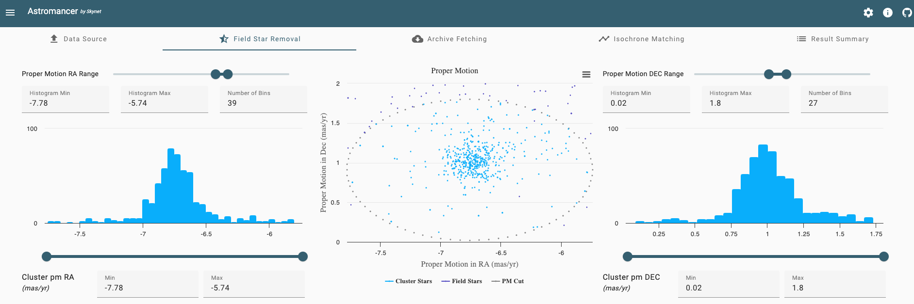
- Next, use the sliders below the proper motion distribution graphs to adjust the Cluster pm RA and Cluster pm DEC ranges. This will affect the size of the ellipse in the 2D proper motion scatter plot, removing stars that are outside the ellipse as “field stars”. You are eventually going to add in a larger data set, incorporating all stars from Gaia that fall within your proper motion cut, so at this point you should be very liberal with the size of your ellipse. Make sure it’s set well outside the apparent proper motion bounds of the cluster (e.g. you might set the range in pm RA to -7.3 to -6.2 mas/yr and the range in pm DEC to 0.3 to 1.7 mas/yr).
- Scroll down to the bottom of the Field Star Removal page so you can apply similar cuts in distance. This all happens with the center Cluster Distance distribution plot. Again, start with the Distance range, bringing the top sliders in to roughly 1.5 to 3.0 kpc. Then bring in the Cluster Distance range sliders at the bottom to similarly liberal limits.
Note: on the far side of the peak in the distance distribution especially, it is advisable to be liberal when setting the limits. Gaia’s distance measurements have greater uncertainty at larger distances than for nearby stars with larger parallax, and we don’t want to exclude too many potential cluster stars with large distance uncertainty. 1.7 to 2.7 kpc seems to be a good range to use for this data set. - While there are still two steps in the full Clustermancer analysis, in the rest of this example we are going to leave those and instead explore two interesting pieces in our results up to this point: the proper motion and color-magnitude distributions.
- First, scroll up to view the Proper Motion scatter plot. Below the plot click “Cluster Stars” and “PM Cut” so the cluster stars and the proper motion boundary ellipse are removed from the graph. With these removed, if you set your cluster distance limits to reasonable values below you should see a continuous distribution of field stars here. To see what would happen if you were too conservative or too strict with your cluster distance limits, try the following:
- Scroll down to distance cuts and set the min distance to 2.2 kpc and the max distance to 2.7 kpc (you don’t need to use the sliders for this; you can just enter the numbers into the fields below). Now, when you look back at the proper motion scatter plot you should see a clump of cluster stars that have been removed from the data set.
- Scroll back down to the distance histogram and first set the Histogram Min to 0 and Histogram Max to 10 (in the fields above the graph). Then, below the graph set the Min value to 0 and the Max value to 10. Now, when you scroll up you should see a hole in the proper motion scatter plot, as we’ve added all the field stars, both between us and the cluster and on the far side of the cluster, to the group of “cluster stars”.
- The lesson in exploring these two extremes is that we can use the proper motion scatter plot not only to discover the cluster stars in proper motion space, but also to verify our cluster distance limits and ensure our constraints are too strict or too loose. This is because the distribution of proper motions in Milky Way field stars which are not at the cluster’s distance and comoving with the cluster (i.e. the cluster stars) should be continuous.
- You can now set the Cluster distance limits back to 1.7 and 2.7 kpc and re-enable Cluster Stars and the PM Cut on the scatter plot.
- The other graph to explore on this page is the color-magnitude diagram at the lower-left. At the top-right of the plot, click the three horizontal lines and “Download PNG image”. (Note: there should be a star of particular interest hiding behind the three lines at the top-right, so please download rather than screen shot the image). Now go back to Afterglow so you can make a color image and compare this to the cluster’s color-magnitude diagram:
- In Afterglow, select the B, V and R images.
- Above the list of images, click the three vertical dots and select “Group selected files” and confirm in the pop-up that you want to group these files.
- Right-click on each of the images and select the blue color map for the B image, green color map for V, and red color map for R.
- Click the top-level combined image, NGC3766.fits, and on the bottom-right click the “Zoom To Fit” button. You should now see a full color image of NGC 3766. This image is not yet a final product (we will get to that in Example 1.2 below). However, you should already be able to compare this image qualitatively with the color-magnitude diagram you produced in the previous step (which you should open now):
- In the tri-color cluster image, you should see two bright orange red giant stars. If both stars were selected as photometry sources (you would have had to manually select these as sources), they should show up as distinct points on your color-magnitude diagram, where the brightest sources are plotted at the top and the reddest sources are plotted on the right. On your color-magnitude diagram, you should therefore see these two stars plotted at the top-right. And since these two stars survived field star removal, you know that they are in fact cluster stars.
- It’s worth clarifying that we know the cool (i.e. red), luminous stars that are located towards the upper-right of the color-magnitude diagram are “giants” because the sizes of stars vary as . Therefore, the largest stars must be those with high luminosity and low temperature, and we call these stars “red giants”. We will discuss these giant stars further when we come to Examples 1.5 and 1.6 below.
- On the top-left of the color-magnitude diagram, you should see a number of bright blue stars that gradually get redder as they get dimmer, just as you see in the image.
- Note that many of the stars in the image are not cluster members. In fact, if you return to Clustermancer and widen your cluster proper motion and distance constraints you will see several stars of all colors and magnitudes plotted on the color-magnitude diagram. The field stars are at varying distances, so do not follow the same color-magnitude trend as the cluster stars (e.g. nearby stars with low luminosity may be relatively bright compared to stars in the cluster with similar luminosity). The main takeaways here are that:
- the color-magnitude diagram is a quantitative graphical representation of the variability in color and magnitude that you see when looking at a color image of a star cluster, and
- star clusters exhibit trends in magnitude-color space that can be useful when attempting to isolate cluster stars from field stars, as these trends should become more apparent once the field stars have been removed; therefore,
- along with the proper motion scatter plot, the color-magnitude diagram should be used to aid in field star removal, by attempting to isolate the cluster stars that fall along the relatively tight correlations in color-magnitude space.
- Please leave both Clustermancer and Afterglow open with your image and field star removal limits set as you proceed to the next example.
